CI
BlueOne…
“Blue” signifies the purity and cleanliness of nature, while “One” refers to the unity of humans and nature. Combining these two words, the resort was named “BlueOne” as an expression of its goal to become an environmentally friendly resort that boasts the purity of nature and allows people to become one with nature. The “BlueOne” resort was created to be an elegant resting space that provides the opportunity to be at one with nature. It seeks to become the country’s most-sought resort that provides customer-centric services, is trusted by customers, and creates a world where nature and nobility coexist.

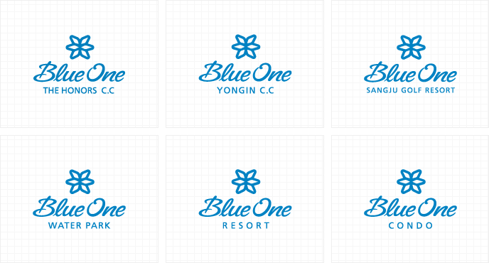
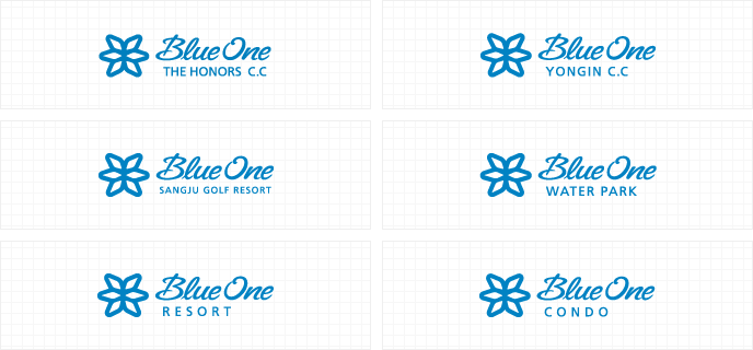
| Symbol mark | With the motifs of sky, stars, light, blossomed flowers, and hexagonal-shaped water in its pure and stable state, the emblem of “BlueOne” represents a beautiful and nature-friendly resort that can provide visitors an experience of happiness, fun, and comfort. It also highlights the distinguished, clean image of “BlueOne,” the center of nature and culture.
 |
|---|---|
| Logotype | The logotype design of “BlueOne” represents its unity and harmony through the emblem while also featuring a unique typeface that expresses the nature of the brand. The logotype is reproduced by copying the document contained in the CD manual. 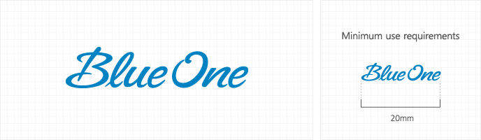 |
| Signature top and bottom |
 |
| Signature left and right |
|
| Brand colors | Taken from the colors of the emblem, the colors of “BlueOne” are widely used in a variety of applications. Therefore it is made sure that when using the colors, accurate hues, brightness and saturation are used. Fundamentally, spot colors are used to express the colors of the emblem, but a 4-color process can be utilized depending on the characteristics of the medium applied as well as the manufacturing costs. 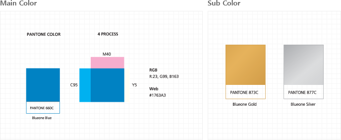 |
copyright (c) 2016 blueone. all rights reserved.